The 2026 Living Room Color Trend Forecast: Colors for Comfort, Personality & Joy
If you’re after a living room that’s both current and calm—but not just chasing trends—you’re in the right place. Here’s how 2026’s color trends can help you make choices that actually last, bringing warmth, depth, and a bit of your own personality into the mix.
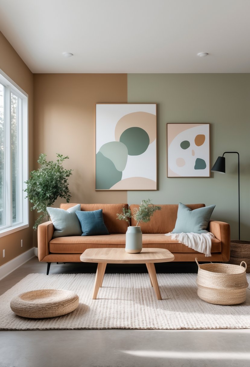
Think palettes that lean warm, earthy, and a little moody—good for bold accents or just a subtle backdrop. Let’s figure out which tones actually fit your vibe and how to mix them so the room feels balanced and inviting (not like a showroom).
1. Earthy Terracotta Hues:
Terracotta’s having a moment for good reason—it’s warm, it’s natural, and honestly, it just feels good to be around. That red-orange clay tone with a bit of brown? Super cozy. It works on walls, accents, or even just a throw pillow if you’re not ready for commitment. Try it with olive green or creamy neutrals for a look that’s calm but not boring.
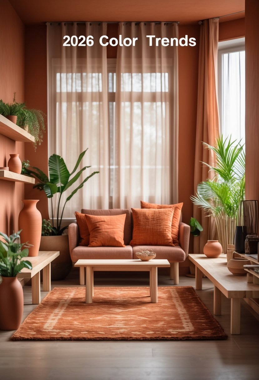
Small room? Terracotta as a single-color drench or accent wall actually makes it feel more inviting. Plus, it ages well and hides scuffs way better than those pale paints everyone used to love.
2. Soft Sage Green:
Soft sage green is like instant calm for your living room. It’s subtle, a little earthy, and pairs with wood tones so easily—no wonder designers keep coming back to it.
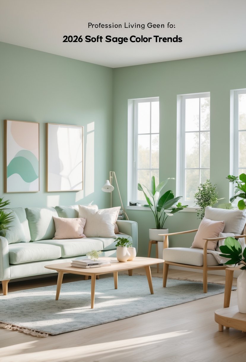
Whether you use it on the walls or just as an accent, it works for modern, cottage, even minimalist looks. With cream, clay, or deep green, it layers up nicely for that lived-in, not-too-perfect feel.
3. Warm Universal Khaki:
Universal Khaki is that grounded neutral that doesn’t try too hard. Warm tan tones play well with wood, creamy whites, and muted greens—pretty much any style you throw at it, it handles.
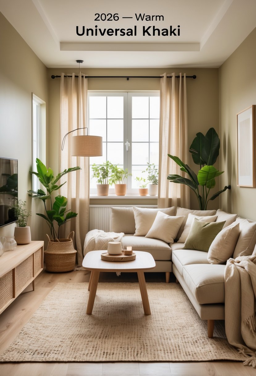
Use it on the main walls for a cozy, versatile backdrop. It’s especially good with darker accents for a bit of contrast, or soft textures if you want that layered look.
4. Deep Moody Espresso:
Deep espresso is the go-to for rich, grounding vibes—totally fits the warm, moody trend everyone’s talking about. It’s almost black but not quite, so it brings depth without feeling cold or stark.

Try it on an accent wall or built-ins to anchor lighter furniture and warm metals. Lighting really matters here—layer it up so the room feels cozy, not like a cave.
Espresso pops with cream, terracotta, or muted green. Add textured fabrics and wood to soften things up and keep it from getting too serious.
5. Sunset-Inspired Oranges:
Warm oranges—think terracotta, deep apricot—bring that sunset glow inside. They’re energetic but not overwhelming, which is honestly kind of rare for orange. Pair with earth neutrals like mushroom beige or creamy sand to ground things. Sometimes just a painted wall or a couple of planters is all you need for impact.
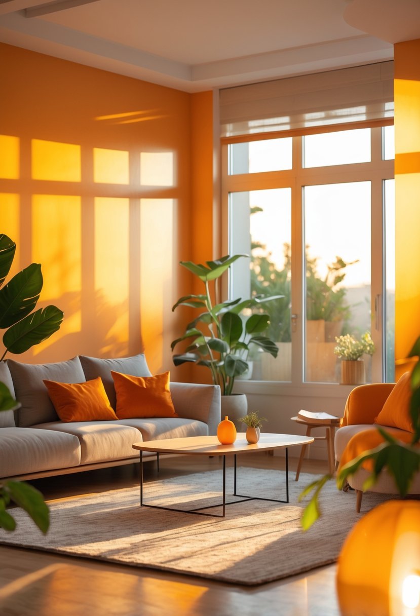
Textured fabrics and matte finishes help tone down the brightness. And heads up: lighting changes the mood a lot, so definitely test a swatch before you commit.
6. Cozy Mushroom Neutrals:
Mushroom neutrals—somewhere between warm beige and soft gray—just have that easy, grounded vibe. Great for walls, upholstery, or rugs if you want a cozy base that doesn’t look flat. They’re at their best with wood and matte black accents. In low light, they feel snug; in sunlight, they’re soft and refined.
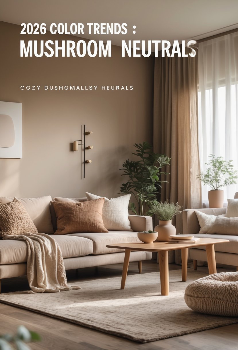
Mix up textures—wool, linen, clay—so things don’t get too monotone. You don’t always need a bold color to keep it interesting.
7. Rich Burnt Sienna:
Burnt sienna is warm and grounded, but not the kind of heavy that drags a room down. It’s got that lived-in look that makes a space feel inviting.
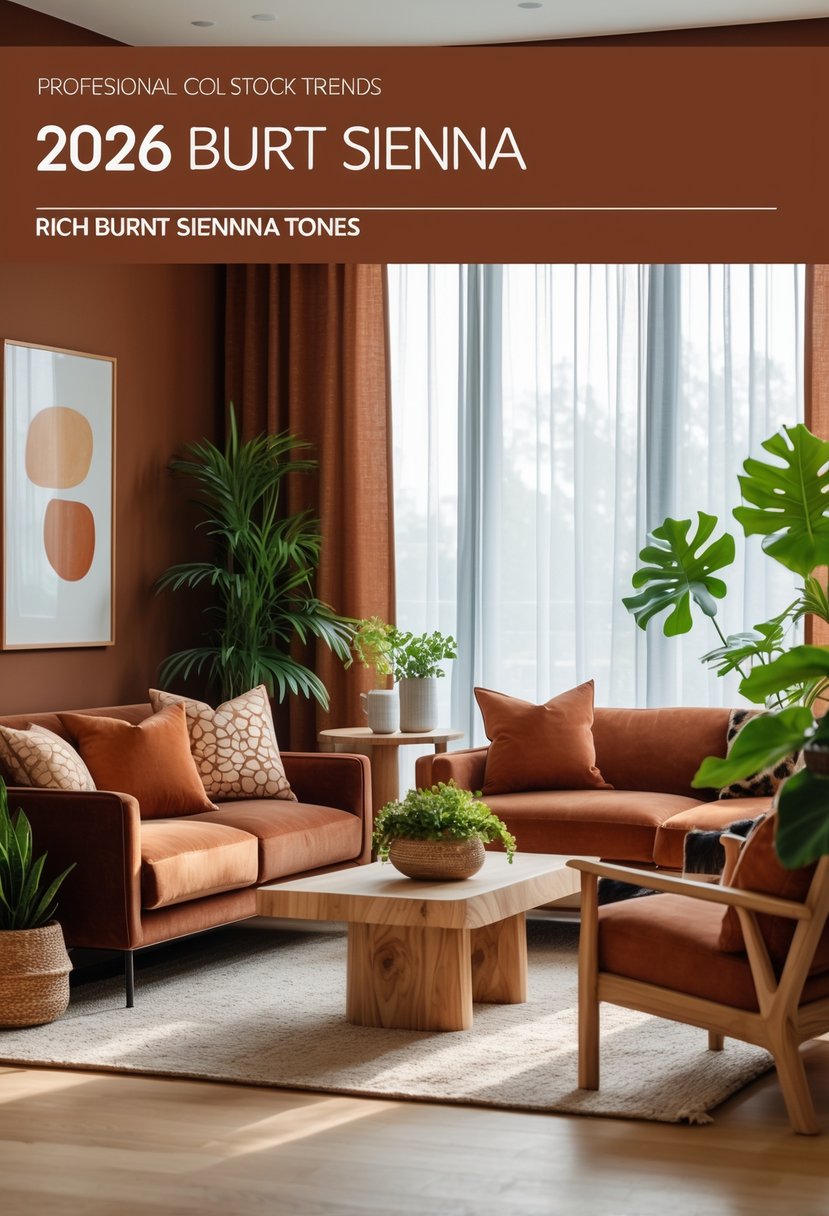
Pair with olive, deep blue, or soft cream for balance. Even just a throw or a statement wall makes a difference.
8. Dusty Rose Accents:
Dusty rose as an accent is pretty much foolproof—warm, subtle, and it doesn’t take over the room. It plays nicely with earth tones, deep greens, and soft neutrals.
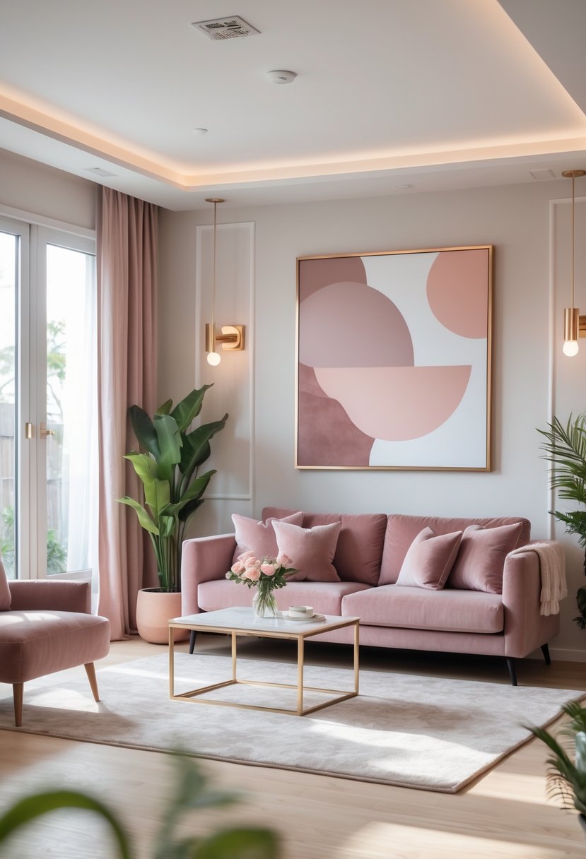
Use it on throw pillows, curtains, or a small chair for a gentle update. It’s easy to swap out if you ever want a change, which is always a plus.
9. Warm Taupe Walls:
Warm taupe gives you that soft, homey backdrop—looks lived-in but still polished. It’s great for bringing out wood tones and making textiles pop, but it doesn’t try to steal the show.

Try it with cream, deep green, or muted blue accents. Sunlight pulls out its golden side, but in cooler light, it leans a bit more gray. Kind of fun to see it shift.
10. Golden Mustard Highlights:
Golden mustard is a little retro, a little earthy, and adds just enough pop to a neutral or earth-toned room. Throw pillows, art, or even a single accent wall—sometimes that’s all you need.
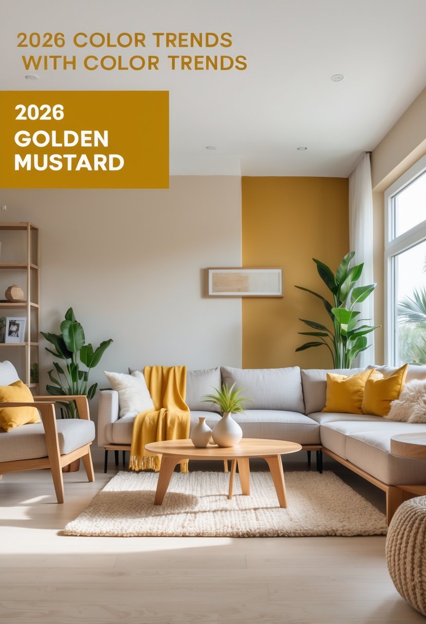
It works well with olive and clay for a palette that feels pulled together. A bit of mustard brings energy and a vintage vibe, but still keeps things calm and comfortable.
11. Olive Green Base:
Olive green’s a solid choice for a warm, grounded base. Use it on the walls to set a calm, natural mood that doesn’t take over the whole room. It’s great with clay, mustard, and ochre accents. Layer in textured fabrics and wood for depth and coziness.
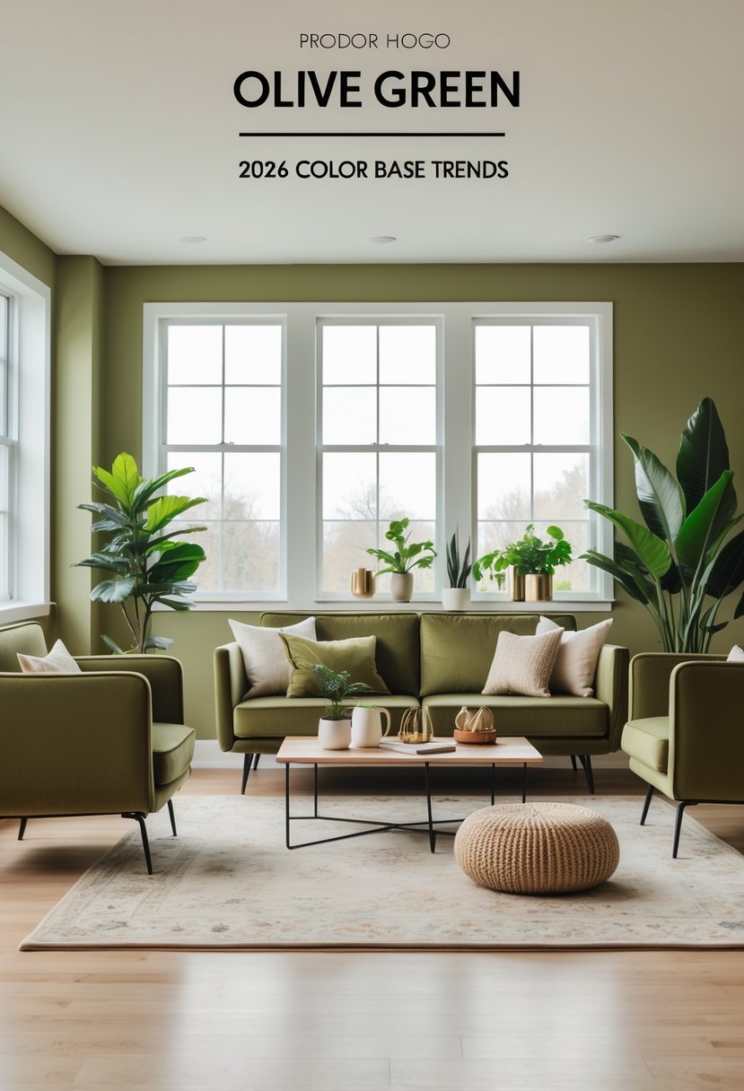
Go for warm lighting to bring out olive’s softer side. If you’re hesitant, try it as an accent wall or on a sofa first—it’s easier than you’d think.
12. Comforting Clay Browns:
Clay browns bring a warm, grounded energy—kind of like a hug for your living room. They’re best with natural wood and woven textures for that relaxed, lived-in feel.
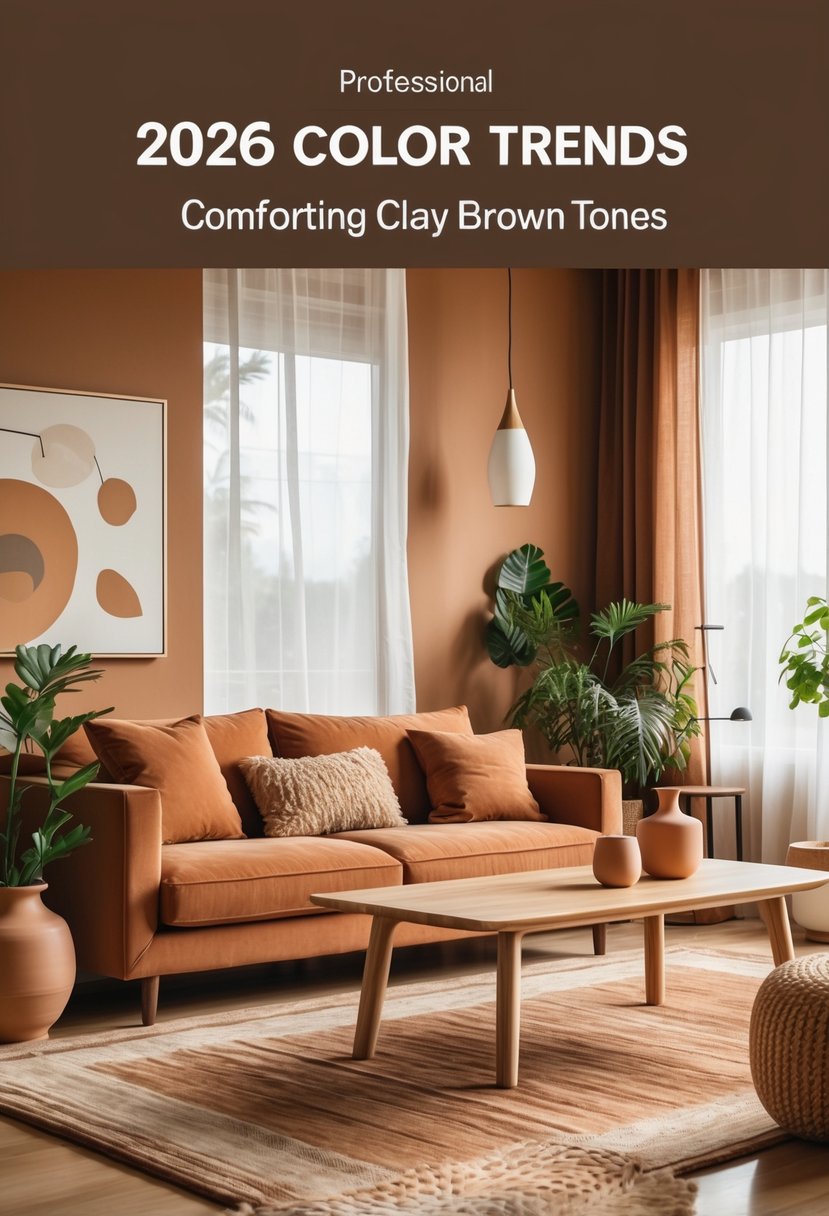
Clay shades work as a neutral but still feel rich. Add soft creams or muted greens to keep things balanced and inviting.
13. Muted Mustard Yellow:
Muted mustard yellow is warm and deep, but not overly bright. It’s a great backdrop for vintage finds and natural textures—nothing too precious or fussy.
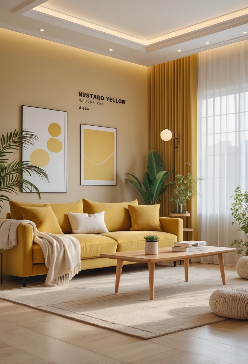
Try it with sage, terracotta, or navy for a balanced look. Matte finishes and soft lighting help keep the color feeling relaxed and lived-in, not flashy.
14. Warm Beige Undertones:
Warm beige undertones have this way of making living rooms feel calm and grounded—almost like a soft exhale. Depending on the light, you might catch gold or even a hint of pink, so honestly, swatching a few testers is worth the extra step.
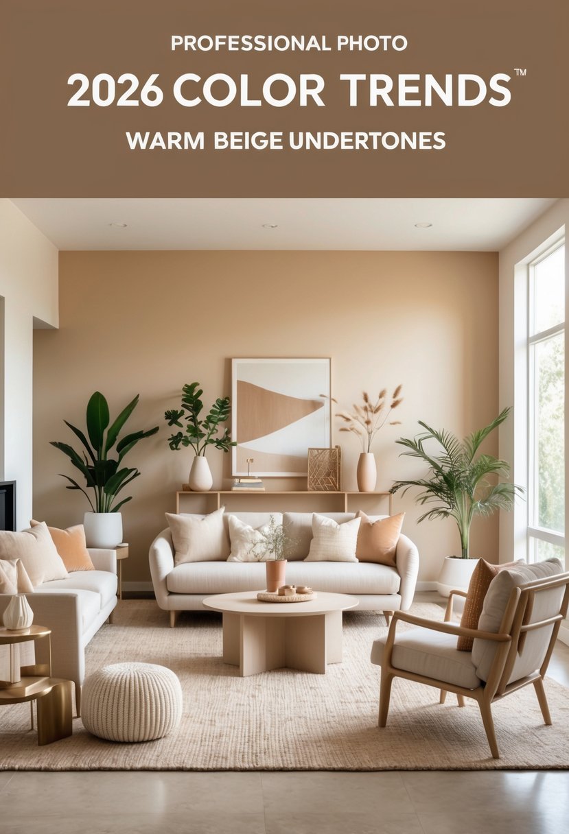
Designers love to pair warm beige with richer accents like clay or deep green for a bit more depth and interest. It’s flexible enough for walls, trim, or even big furniture pieces if you’re after that cohesive, cozy look everyone seems to crave.

